by Stacey Cogswell, Independent Stampin'Up Demonstrator

Wednesday, March 30, 2011

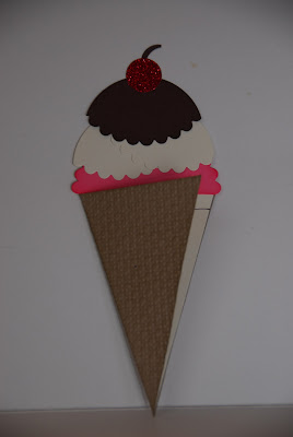
Ice Cream Anyone?


Created by Stacey Cogswell
Copyright Stampin'Up!

Here is another fun project made with the Petal Cone Die.  I saw a version of this card made by Jackie Topa, but instead of having the card slide out, I decided to have my card just open.  It uses only one box piece textured with the Square Lattice Impressions folder to create the "cone".  The chocolate and vanilla "ice cream" was made by first punching a 2 1/2" circle and then placing this punched circle onto the Petal Cone Die over the half scalloped area making sure to cut only the scallop area with the die. (Check out Jackie's blog to see how to make the "Ice Cream" shapes in more detail.  A second box piece was cut with the Petal Cone Die and then cut in half to create the area inside of the card for the greeting.  Punch a 1/2" circle out of red glitter paper and you've got the finishing touch of your card.....a glittery cherry! 

Products Used to Create this Card:

Stamp Set:  A Word for You
Card Stock: Crumb Cake, Chocolate Chip, Rose Red, Very Vanilla and Glitter Red
Ink: Chocolate Chip and Rose Red pad/marker
Accessories: Big Shot with Square Lattice Impression folder and Petal Cone Die, 3/4" Circle punch, 2 1/2" Circle punch, sponge and blender pen.

Do you know an easy way to get two colors on one stamp?  This is how I do it.  Ink up the stamp with the first color then remove the ink from the area you want another color with the blender pen.  Ink up this area using a marker in the second color, huff on the stamp to re-wet the ink and stamp. 

Smiles,
Stacey

Monday, March 28, 2011

Embedded Technique

In the last stamp camp I introduced a technique called Embedding.  This is a really fun technique and once you try it you'll be hooked!  In the last week I've made four cards, two of which I'll show you, using this technique. You can use an array of circle punch sizes to create this cool look.  One punch size can keep the pattern simple, but many punches sizes makes a interesting abstract pattern.  This is one of those fun techniques that never turns out the same twice, which for some is hard to think about, but you'll have to try it.

Created by Stacey Cogswell
Copyright Stampin'Up!

This is how to create the Embedded look:
Glue random punches circles (or any punched shape) on a base piece of card stock.  Try punching a smaller circle in the card stock first, then punch out a larger circle around the smaller circle.  When this double punched circle is placed on the base card stock the "hole" will allow the base card stock to show through, giving it the look of two circles on top of each other, but with out the added bulk of a third layer of paper. When you're done, run this piece of card stock through the Big Shot using the Square Lattice Impressions folder (or any full texture folder.)  By dry embossing the card stock you are "embedding" the layers of card stock together to create the look of fabric.  It's so cool and I hope you try it!

Smiles,
Stacey

Friday, March 25, 2011

Look through the Window

Created by Stacey Cogswell
Copyright Stampin'Up!

Have you seen the new Window Panes in the Occasions Mini Catalog?  You might not have noticed them or thought they would be too "plastic" looking, but they are really not.  They have the look and feel of heavy glass, but they are crystal clear plastic.  You get 12 window panes (4 each of 3 sizes) for only $7.95.  They make a fun addition to a card front and I love the way they look.  They are made with little slot on each side, so you can add ribbon in my case I added a little piece of matching paper. They are a little thick, but well worth the effort to create a great card and hand deliver it!

Products used to make this card:  
Stamp Set: A slice of Life (Level I hostess set) and You're a Gem (greeting)
Card Stock:  Early Espresso, Crumb Cake, Soft Suede, Very Vanilla and Watercolor paper.
Designer Series Paper: Elegant Soiree
Ink: Early Espresso, Crumb Cake, Soft Suede and Baja Breeze
Accessories: Window Pane (121881), Aqua painter, Big Shot with Square scallop die, dew drops and little gems.

Smiles,
Stacey

Wednesday, March 23, 2011

March Stamp Camp Treats

Wow....where has the time gone!  It seems like just a few days ago that I was posting pictures of the February stamp camp treats! Anyway, here is the special treats that all my March stamp campers received just for coming to camp.

I used the Eat Chocolate stamp set to make a fun greeting to fit inside a clear little box tied with a strip of Springtime Vintage designer fabric.  They turned out great and were super easy to make, but even more fun to give, since of course they had chocolate inside!

Created by Stacey Cogswell
Copyright Stampin'Up

Enjoy,
Stacey                 

Monday, March 7, 2011

February Stamp Camp Treats

Each month I create a special treat for each of my stamp campers.  By creating a partial box, adding two tags made with the Two Tags die and some designer paper, I created this fun little basket for the February stamp camp. The image is from the Sale-a-bration set, which I colored with makers before stamping to the paper.  I used retired designer paper to wrap around the basket and the chocolate nuggets inside. 

Hope you like it.
Smiles, Stacey


Like with many projects, we demonstrators share ideas, so I wanted to give credit and thanks to Helen C. and Jessica W. for sharing this wonderful little basket with me.

Created by Stacey Cogswell
Copyright Stampin'Up!

Saturday, March 5, 2011

Beautiful Butterflies

Created by Dorothy C.
Copyright Stampin'Up!


This beautiful butterfly card was sent to me by one of my wonderful customers.  Isn't cute!  She first glued the base butterflies to the white CS before dry embossing it with the Polka Dots impressions folder.  This technique is called "embedding".  Then she added the cut out stamped butterflies over the blue butterflies which gives it a great shadow effect.  For added detail, she even stamped and cut out the little tiny butterfly bodies.  Great job!  Thanks so much for sharing with me.

Smiles,
Stacey

Thursday, March 3, 2011

More Rubbed Background Ideas

Have you tried it yet?  Well, if you have and you've mastered the basic technique, let me show you what you can do next.  Create a Batik look by flicking the inked CS with water either by using either your fingers or a paint brush.  It will give you this look:

Now doesn't that look cool?  Let's see some projects made with this fun looking paper.

For both of these bookmarks, I heat embossed the image with black embossing powder.  I added some Gold Spritz spray to the image on the right to give it a little sparkle.

Here is another way to change it up.  Spray a stamp of your choice (a solid image works best) with water then stamp it to your inked background. The water, like in the flicking sample, will wick up the ink and leave a "white" spot.
Lastly, you can also stamp your inked CS background with ink.  Here I used the Sanded background stamp to give the inked paper a rustic look.

So, I hope you like what you've seen and you'll get it a try.  Please leave me a comment and let me know if you would like to see more postings like this.  There are so many different ways to change up this technique, so see what you can do.....I'd love to see what you can come up with!

Have a wonderful day!
Smiles,
Stacey

Wednesday, March 2, 2011

Rubbed Ink Background

Yesterday's post featured a card with a new technique that is so much fun that I can't stop creating projects with it!  I'm not sure if this technique has an official name, so I'm calling it the Rubbed Ink Background technique.  Once you master the basic technique there are so several things you can do with this background to change it up (I'll show you a few ideas.)  To start, you'll need a piece of card stock, two or three colors of classic ink and sponges.  Holding your piece of CS with one hand, pick up some ink on a sponge then rubbing in a circular motion starting on your work surface then onto the CS.  You never want to start rubbing right on the CS, because you won't get a the soft blended effect were looking for.  Rub several areas with one color then fill in the other areas with the next color, blending the two colors as you go.  If you are working with a large piece of CS, always start rubbing off from the edge into the middle of the CS.  You can add a third color if you like to darken an area or to make the edges of the CS darker.

Created By Stacey Cogswell
Copyright Stampin'Up!


For this card I used Riding Hood Red and Cherry Cobbler Classic ink for the center background CS piece.  It's hard to see, but it's has a soft two tone effect. So, give it a try and see what you think.

Smiles,
Stacey

Tuesday, March 1, 2011

Work of Art from the Heart

Have you ever had a conversation with someone that left you thinking long after in was over?  Well, I had one of those conversations a couple of days ago.  We were discussing what makes a person want to collect something.  You know what I mean.....we've all collected something.  In my childhood I loved Teddy Bears (still do really), then in my young adulthood I tried to collect every Beanie Babies that came out.  My son has numerous collections and his friends collect all kinds of thing that just don't make since to either one of us.  So in this conversation, a person (who remain nameless...you'll understand) says to me "Well, how many cards can a person make or have?"  (How could someone ask such a question!?) Well, this caught me off guard and I was unable to answer it.  This question is intriguing and I've thought about it a lot and I think I've finally come up with the answer.  Every card or project I make is not simply a piece of paper, but a work of art from the heart, especially if it's being made for someone special.  This is most true for me when I'm creating a sympathy card.  I put a lot of emotion/thought into the these types of cards and try to have the recipient "feel" this sincere heart felt emotion.

Here is one of those card that I made for a wonderful customer who lost a dear friend to cancer.  I wanted a card with soft neutral colors, but not yet still feminine.  I think it came out pretty nice.  I used a new technique where you rub a piece of card stock with several colors of ink to create a interesting one of a kind tonal background paper.  I even rubbed the ribbon with the same ink colors to make it match the card. 

So, I guess the person who asked me this question just doesn't get it.  Making cards is not just about collecting rubber stamps and craft supplies, it's about making Art from the Heart!

Smiles,
Stacey


Created by Stacey Cogswell
Copyright Stampin'Up!